


Redesigning a centralized tool was part of an admin redesign for our new azeti Cloud. This centralized tool is known as our Widget Designer. The overarching goal of the Widget Designer is to give our users a simple to use tool to visualize their data, compare and customize widgets to their own needs, monitor their own specific data and get all information they will want — even on the go! The challenge was coming up with a template that includes all of the above, despite the contraints of space on mobile.
The full scope of the project entailed product design starting from discovering requirements, user and business needs, UX & UI design, writing users stories, priortizing features, planning design sprints, revising (alot), restructing information architecture and developing a design system.
Let's jump to it!
The core function of the Widget Designer is our navigation tool bar which is located on the left side on desktop and bottom on mobile (highlighted in red). The navigation tool bar enables our users to swiftly and surely navigate to the next step. Good navigation should feel like an invisible hand that guides the user. As Jakob Nielson says, recognizing something is easier than remembering it. This means that you should minimize the user’s memory load by making actions and options visible. In the steps below I will walk you through each step of our Widget Designer.
Step 1. Search for the sensors the user would like to view
Displaying a list view was a more suitable design for the first step given the information that was needed to display. The list view allows us to keep the important information visible and store the extended information with clicking on the collapse arrow on the right. We applied this to both the desktop and mobile. Due to the limited amount of space on mobile we took out the labels to highlight the important information.
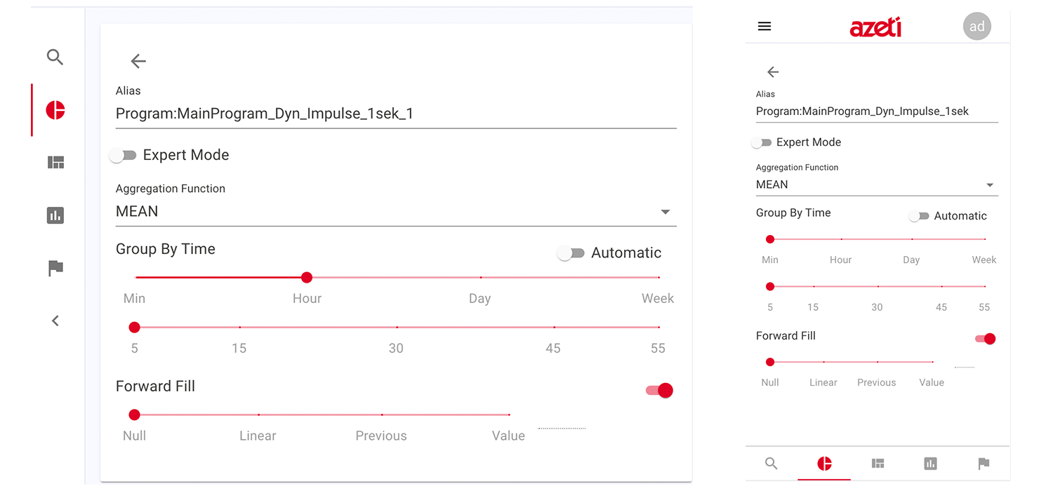
Step 2. Edit queries
The edit queries allows users to easily customize the queries alias, the intended aggregation function and desired group settings. The expert mode is a place where the users can configure their queries manually using their knowledge with influxdb syntax. This gives the users more options to customize their data.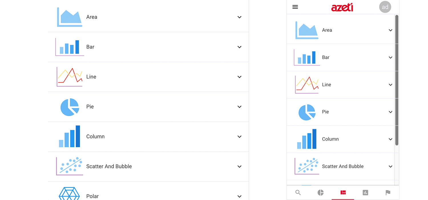
Step 3. Selecting templates
After much research our CEO Sebastian Koch discovered a savvy and sophicated customization tool for templates and charts. Implementing highcharts brings much ease and simplicity to our widget designer. It allows for our users to easily define what charts they would like to use to visualize their data.
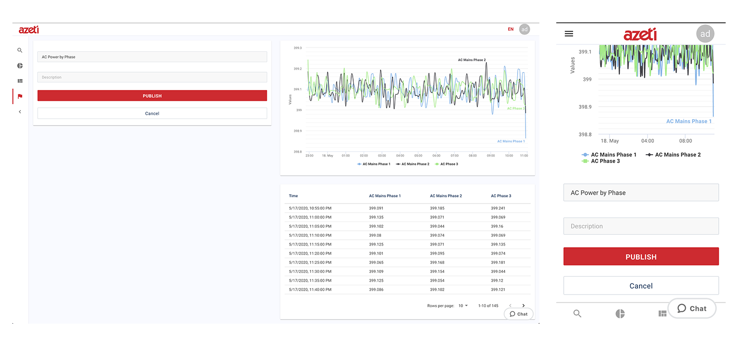
Step 4. Publish
After three simple steps the users are ready to publish their widgets. Add a short description or comment and the widget is ready to publish.The users are then redirected to their dashboard.
The Widget Designer for our new azeti Cloud brings much ease to our clients needs when visualizing their data. It is very rewarding to see the efforts of the past few months translate into a easy to use clean data visualization.
Stay tuned for future releases!
Background photo created by valeria_aksakova - www.freepik.com